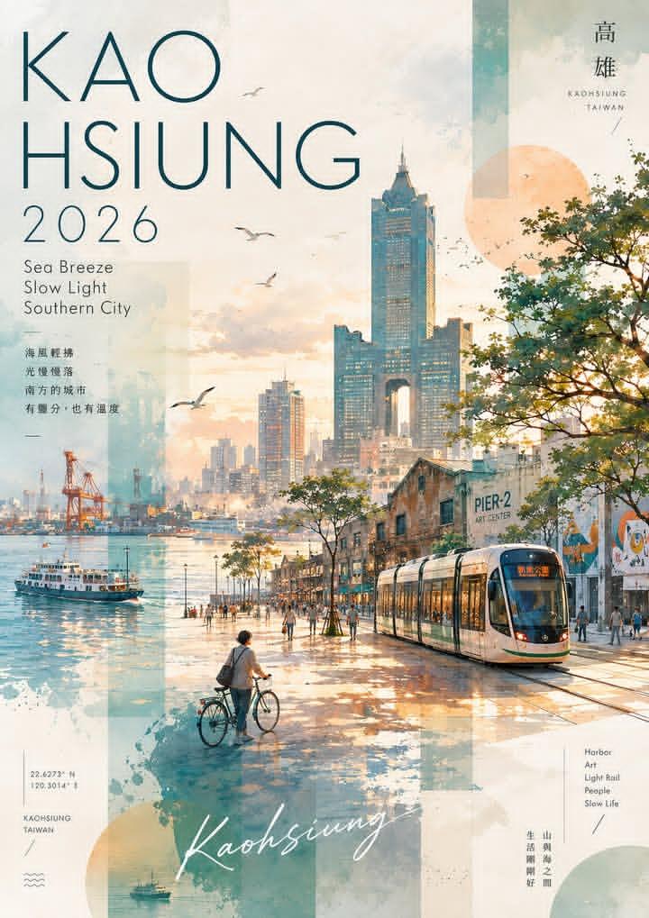
Watercolor and collage travel poster for Kaohsiung, Taiwan, vertical layout, soft pastel and warm golden hour color palette. Scene: waterfront promenade at sunset with a modern light rail tram on the right, a person walking a bicycle on the left, and people strolling along the path. In the background: Kaohsiung skyline with the 85 Sky Tower and other skyscrapers, a harbor with a ferry boat, port cranes, and the Pier-2 Art Center building with murals. Seagulls flying in the sky, trees lining the walkway, calm water reflecting the light. Design elements: large text top left reading "KAO HSIUNG 2026", smaller text below reading "Sea Breeze Slow Light Southern City"; top right destination marks and "KAOHSIUNG TAIWAN" in small caps; bottom left coordinates "22.6273 N 120.3014 E", "KAOHSIUNG TAIWAN", wave icon; bottom center handwritten script "Kaohsiung"; bottom right vertical list "Harbor Art Light Rail People Slow Life"; semi-transparent geometric shapes, watercolor splashes, and texture layers in teal and beige. Style: modern travel poster meets watercolor painting, airy and atmospheric, blend of illustration and photo-collage, warm and tranquil mood, high detail.
Negative prompt
generic skyline, messy text, unreadable destination marks, harsh colors, flat tourist brochure layout
How to adapt this prompt
Turn the example into your own brief.
Replace the subject, product, place, or audience.Keep the composition and camera language, then swap the object, brand, city, or customer.Preserve lighting and material constraints.Reuse the lighting, texture, and finish details that make the image feel specific.Match the aspect ratio to the channel.Move between square, vertical, and wide crops based on ads, posts, covers, or landing pages.Tighten the negative prompt after review.Add exclusions for text errors, distorted objects, clutter, or style drift after the first result. What this prompt is good for
Kaohsiung Watercolor Travel Poster is built for AI travel poster prompt for destination marketing.
Use this AI image prompt when you need a focused Editorial Visuals result with a clear style direction, a defined format, and enough visual constraints to avoid generic output.
- Best search intent: AI travel poster prompt, Watercolor poster, and Destination marketing
- Primary workflow: AI travel poster prompt for destination marketing
- Recommended output format: 2:3
Prompt breakdown
Key controls inside this Watercolor collage travel poster prompt.
The prompt combines subject direction, lighting, composition, visual style, and output quality in one reusable brief. Keep those constraints together when you adapt it for your own image.
- Style anchor: Watercolor collage travel poster
- Category context: Editorial Visuals
- Includes a negative prompt to reduce style drift, distorted details, and unwanted artifacts.
Best variations to try
Adapt this prompt without losing the original image logic.
Start by changing the subject, product, place, color palette, or audience. Keep the camera language and visual hierarchy stable until the result matches the page, ad, post, or campaign you are building.
- Swap the subject while keeping the 2:3 composition.
- Turn the style into a new campaign by changing colors, wardrobe, props, or location.
- Use the prefilled generator link to test the prompt, then refine one variable at a time.
Internal prompt paths
Explore more Editorial Visuals prompts.
Browse nearby workflows, compare prompt packs, or open the generator with this example already loaded.
Prompt FAQ
Common questions about this AI image prompt.
What can I create with the Kaohsiung Watercolor Travel Poster prompt?
You can use it to create AI travel poster prompt for destination marketing in a Watercolor collage travel poster style, with a recommended 2:3 aspect ratio and search-friendly image direction.
Can I edit this AI image prompt for another subject?
Yes. Replace the subject, product, place, audience, or brand details while preserving the lighting, composition, aspect ratio, and quality constraints that give the prompt its structure.
Which aspect ratio works best for this prompt?
This example is designed around a 2:3 aspect ratio. You can change it for another channel, but keep the framing and hierarchy consistent when moving to square, vertical, or wide formats.
Should I use the negative prompt?
Yes. The negative prompt helps reduce issues such as generic skyline, messy text, unreadable destination marks, harsh colors, flat tourist brochure layout. Use it as a starting point and add exclusions after reviewing your first result.