Modern metro system engineering infographic with a central train render, technical specifications, network map, safety panels, and sustainability modules.1:1
Modern metro system engineering infographic with a central train render, technical specifications, network map, safety panels, and sustainability modules.

Editorial Visuals

Modern Metro Engineering Infographic

An AI metro infographic prompt example for a modern metro system reference sheet with train render, engineering callouts, network map, safety panels, and sustainability modules.

AI metro infographic prompt exampleModern metro systemTransportation infographic
Published Updated

Prompt template

Modern Metro Engineering Infographic reusable AI image prompt

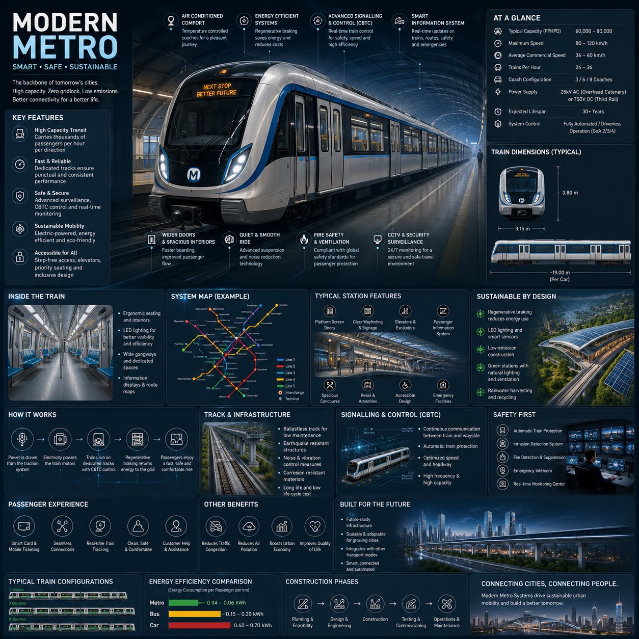
Create a premium square reference-style urban transportation infographic centered on a futuristic modern metro system called [METRO NAME]. The layout should feel like a visual encyclopedia page mixed with an elite railway infrastructure field guide, not a public transport advertisement.

Canvas and visual system: 1:1 square composition, dark premium urban-tech background, subtle railway schematics, metro map overlays, deep navy, matte black, steel gray, electric blue accents, and soft white lighting. Use rounded modular information cards, clean spacing, thin annotation lines, minimal transit icons, and a high-density but readable editorial hierarchy.

Main subject: place an ultra-detailed realistic modern metro train in the center, viewed in dramatic three-quarter perspective inside a futuristic underground station. Show aerodynamic train design, glowing destination display, stainless steel textures, smart glass windows, illuminated platform lighting, realistic reflections, and premium rail infrastructure.

Engineering callouts: annotate regenerative braking, smart signalling and CBTC control, electric propulsion, passenger information systems, surveillance and safety systems, platform screen doors, accessibility features, smart ventilation, energy-efficient lighting, and track infrastructure.

Modular sections: include "Metro System Overview", "Technical Specifications", "Train Dimensions", "Passenger Capacity", "Inside the Train", "Station Features", "System Map", "Sustainability", "How It Works", "Signalling & Control", "Safety First", "Passenger Experience", "Energy Efficiency", and "Built for the Future".

Style: AI metro infographic prompt example, premium transport engineering handbook, realistic train render, clean information architecture, crisp micro-icons, readable labels, cinematic underground station lighting, future mobility presentation quality.

Negative prompt

messy dashboard, unreadable microtext, generic subway ad, low-detail train, random transit map, oversaturated neon, cluttered panels, distorted icons, flat poster with no engineering depth

How to adapt this prompt

Turn the example into your own brief.

Replace the subject, product, place, or audience.Keep the composition and camera language, then swap the object, brand, city, or customer.
Preserve lighting and material constraints.Reuse the lighting, texture, and finish details that make the image feel specific.
Match the aspect ratio to the channel.Move between square, vertical, and wide crops based on ads, posts, covers, or landing pages.
Tighten the negative prompt after review.Add exclusions for text errors, distorted objects, clutter, or style drift after the first result.

What this prompt is good for

Modern Metro Engineering Infographic is built for AI metro infographic prompt example for transportation explainers and infrastructure presentations.

Use this AI image prompt when you need a focused Editorial Visuals result with a clear style direction, a defined format, and enough visual constraints to avoid generic output.

  • Best search intent: AI metro infographic prompt example, Modern metro system, and Transportation infographic
  • Primary workflow: AI metro infographic prompt example for transportation explainers and infrastructure presentations
  • Recommended output format: 1:1

Prompt breakdown

Key controls inside this Premium metro engineering infographic prompt.

The prompt combines subject direction, lighting, composition, visual style, and output quality in one reusable brief. Keep those constraints together when you adapt it for your own image.

  • Style anchor: Premium metro engineering infographic
  • Category context: Editorial Visuals
  • Includes a negative prompt to reduce style drift, distorted details, and unwanted artifacts.

Best variations to try

Adapt this prompt without losing the original image logic.

Start by changing the subject, product, place, color palette, or audience. Keep the camera language and visual hierarchy stable until the result matches the page, ad, post, or campaign you are building.

  • Swap the subject while keeping the 1:1 composition.
  • Turn the style into a new campaign by changing colors, wardrobe, props, or location.
  • Use the prefilled generator link to test the prompt, then refine one variable at a time.

Prompt FAQ

Common questions about this AI image prompt.

What can I create with the Modern Metro Engineering Infographic prompt?

You can use it to create AI metro infographic prompt example for transportation explainers and infrastructure presentations in a Premium metro engineering infographic style, with a recommended 1:1 aspect ratio and search-friendly image direction.

Can I edit this AI image prompt for another subject?

Yes. Replace the subject, product, place, audience, or brand details while preserving the lighting, composition, aspect ratio, and quality constraints that give the prompt its structure.

Which aspect ratio works best for this prompt?

This example is designed around a 1:1 aspect ratio. You can change it for another channel, but keep the framing and hierarchy consistent when moving to square, vertical, or wide formats.

Should I use the negative prompt?

Yes. The negative prompt helps reduce issues such as messy dashboard, unreadable microtext, generic subway ad, low-detail train, random transit map, oversaturated neon, cluttered panels, distorted icons, flat poster with no engineering depth. Use it as a starting point and add exclusions after reviewing your first result.