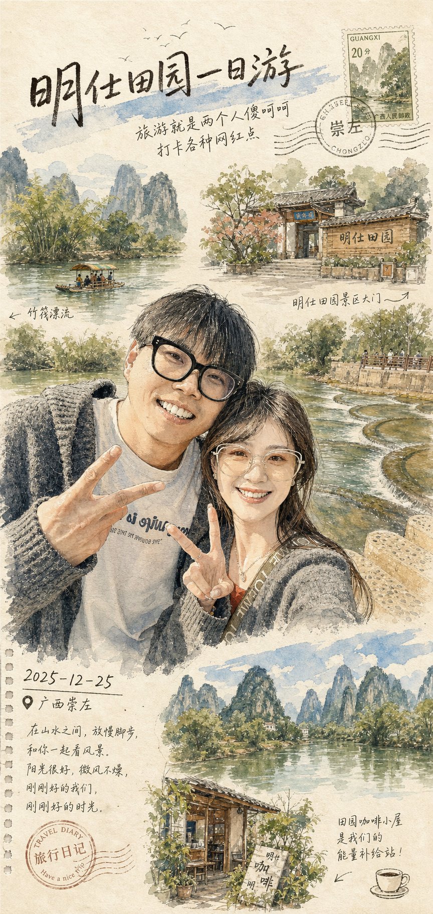
Transform the attached destination photo into a dreamy watercolor travel postcard illustration.

Style: use hand-painted urban sketchbook aesthetics, delicate ink linework, soft watercolor washes, visible paper texture, loose expressive brush strokes, watercolor bleeding edges, and a calm cinematic slice-of-life mood.

Composition: create a vertical poster design with architectural sketch details, natural perspective, atmospheric depth, quiet negative space, and a premium art print finish. Use muted earthy colors including warm browns, faded greens, cream whites, and soft blue accents.

Editorial details: add a handwritten medium title at the top: "[CUSTOM TITLE]". Add small handwritten notes: "[CUSTOM NOTE]", date: "[CUSTOM DATE]", location: "[CUSTOM LOCATION]", and subtle travel stamp elements. Keep all text neat and intentional.

Style: AI travel watercolor postcard prompt example, watercolor travel postcard, urban sketchbook illustration, travel journal composition, editorial postcard layout, nostalgic destination art.
Negative prompt
photorealistic snapshot, messy text, unreadable notes, harsh digital gradients, flat poster, muddy watercolor, real brand logo, crowded stamp collage, low-resolution paper texture
How to adapt this prompt
Turn the example into your own brief.
Replace the subject, product, place, or audience.Keep the composition and camera language, then swap the object, brand, city, or customer.Preserve lighting and material constraints.Reuse the lighting, texture, and finish details that make the image feel specific.Match the aspect ratio to the channel.Move between square, vertical, and wide crops based on ads, posts, covers, or landing pages.Tighten the negative prompt after review.Add exclusions for text errors, distorted objects, clutter, or style drift after the first result. What this prompt is good for
Travel Watercolor Postcard is built for AI travel watercolor postcard prompt example for travel creators, destination guides, editorial postcards, and location memory prints.
Use this AI image prompt when you need a focused Editorial Visuals result with a clear style direction, a defined format, and enough visual constraints to avoid generic output.
- Best search intent: AI travel watercolor postcard prompt example, Watercolor travel postcard, and Urban sketchbook illustration
- Primary workflow: AI travel watercolor postcard prompt example for travel creators, destination guides, editorial postcards, and location memory prints
- Recommended output format: 3:4
Prompt breakdown
Key controls inside this Watercolor travel postcard prompt.
The prompt combines subject direction, lighting, composition, visual style, and output quality in one reusable brief. Keep those constraints together when you adapt it for your own image.
- Style anchor: Watercolor travel postcard
- Category context: Editorial Visuals
- Includes a negative prompt to reduce style drift, distorted details, and unwanted artifacts.
Best variations to try
Adapt this prompt without losing the original image logic.
Start by changing the subject, product, place, color palette, or audience. Keep the camera language and visual hierarchy stable until the result matches the page, ad, post, or campaign you are building.
- Swap the subject while keeping the 3:4 composition.
- Turn the style into a new campaign by changing colors, wardrobe, props, or location.
- Use the prefilled generator link to test the prompt, then refine one variable at a time.
Internal prompt paths
Explore more Editorial Visuals prompts.
Browse nearby workflows, compare prompt packs, or open the generator with this example already loaded.
Prompt FAQ
Common questions about this AI image prompt.
What can I create with the Travel Watercolor Postcard prompt?
You can use it to create AI travel watercolor postcard prompt example for travel creators, destination guides, editorial postcards, and location memory prints in a Watercolor travel postcard style, with a recommended 3:4 aspect ratio and search-friendly image direction.
Can I edit this AI image prompt for another subject?
Yes. Replace the subject, product, place, audience, or brand details while preserving the lighting, composition, aspect ratio, and quality constraints that give the prompt its structure.
Which aspect ratio works best for this prompt?
This example is designed around a 3:4 aspect ratio. You can change it for another channel, but keep the framing and hierarchy consistent when moving to square, vertical, or wide formats.
Should I use the negative prompt?
Yes. The negative prompt helps reduce issues such as photorealistic snapshot, messy text, unreadable notes, harsh digital gradients, flat poster, muddy watercolor, real brand logo, crowded stamp collage, low-resolution paper texture. Use it as a starting point and add exclusions after reviewing your first result.