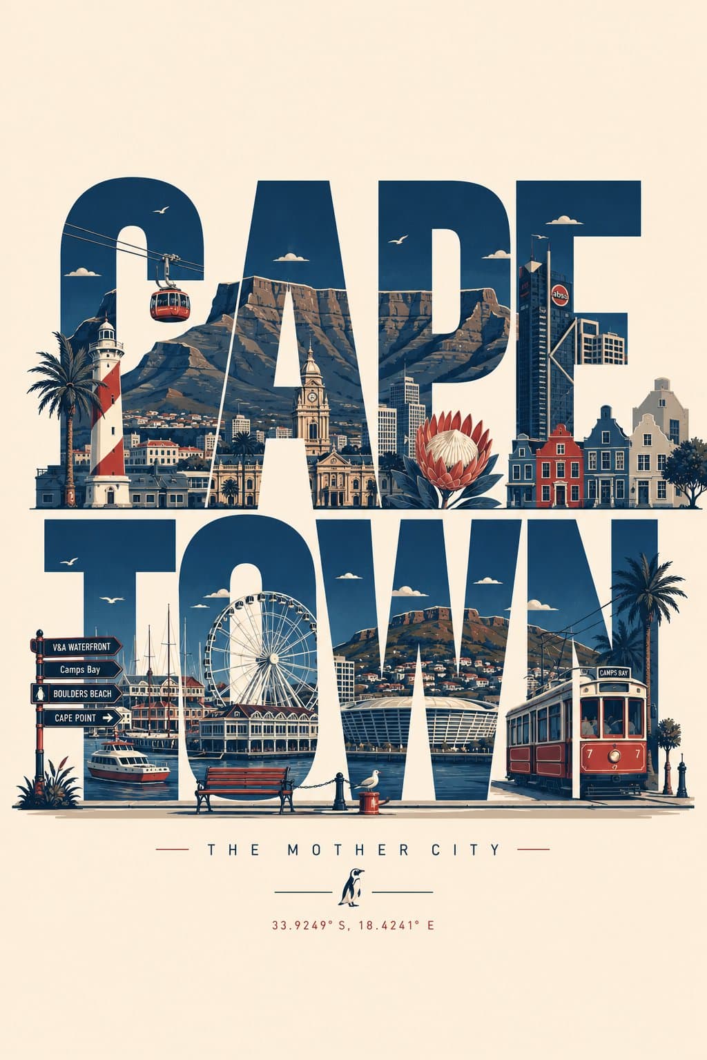
Modern typographic travel poster where the city name forms the layout and local landmarks are integrated into bold uppercase letters.3:4
Modern typographic travel poster where the city name forms the layout and local landmarks are integrated into bold uppercase letters.

Editorial Visuals

City Landmark Typography Travel Poster

An AI typography travel poster prompt example where the city name becomes the composition, with landmarks integrated into bold sans-serif letters.

AI typography travel poster prompt exampleCity name posterLandmark typography
Published Updated

Prompt template

City Landmark Typography Travel Poster reusable AI image prompt

Create a clean, modern typographic travel poster where the city name itself becomes the composition. Render the city name in large, bold, uppercase sans-serif letters spanning the width of the artwork.

Seamlessly integrate the city's most iconic landmarks, architecture, monuments, streets, transportation, cultural symbols, cafes, bridges, parks, skylines, sculptures, waterfronts, historic buildings, and local details into, around, and inside the letters. Let landmarks naturally interact with the typography while preserving legibility.

Use an elegant flat vector illustration style with crisp geometric shapes, minimal detail, clean outlines, subtle shadows, and a premium editorial aesthetic. Maintain a limited color palette of deep navy, warm cream, muted red, and soft gray-blue for a timeless travel-poster look.

Add small decorative elements such as street lamps, trees, clouds, birds, benches, bicycles, fountains, trams, ferries, or other city-specific objects where appropriate. Keep generous negative space with a clean background and perfectly balanced composition.

Ensure every landmark, architectural style, vehicle, sign, and cultural element is accurate to the chosen city. Avoid generic or incorrect landmarks. If desired, include a small elegant tagline beneath the city name, such as a famous nickname or slogan, in minimal typography.

Style: premium flat vector, minimalist travel poster, geometric illustration, editorial design, tourism branding, clean typography, high contrast, ultra-sharp lines, museum-quality print, modern graphic design, centered composition, scalable SVG aesthetic, and 8K resolution.

Negative prompt

illegible city name, generic landmarks, wrong city icons, crowded letters, noisy background, weak typography, random tourist clipart, low-contrast palette, warped architecture
Prompt-specific breakdownWhat makes this prompt different.
Subject and scene

Create a clean, modern typographic travel poster where the city name itself becomes the composition

Keep this cue visible when adapting the prompt for another ai typography travel poster prompt example for destination marketing, city editorial covers, and tourism brand visuals image.
Composition and hierarchy

Render the city name in large, bold, uppercase sans-serif letters spanning the width of the artwork

Use this part to protect the 3:4 layout and avoid a generic composition.
Lighting and material cues

Seamlessly integrate the city's most iconic landmarks

Treat this as the quality control layer for the flat vector typographic travel poster look.
Style and output constraints

Let landmarks naturally interact with the typography while preserving legibility

Review text carefully after generation because typography is often the first place image models drift.
Variation promptsRewrite this example for nearby use cases.

These variations keep the core image logic from this prompt while changing one variable at a time.

Change the subject

Create a 3:4 editorial visuals image for [new subject]. Keep this prompt logic: Create a clean, modern typographic travel poster where the city name itself becomes the composition. Use Flat vector typographic travel poster styling for AI typography travel poster prompt example for destination marketing, city editorial covers, and tourism brand visuals, but replace the product, character, place, or audience with [your brief].

Change the channel

Adapt this concept for [ad, product page, thumbnail, story, poster, or hero image]. Preserve the Render the city name in large, bold, uppercase sans-serif letters spanning the width of the artwork and keep the result focused on AI typography travel poster prompt example for destination marketing, city editorial covers, and tourism brand visuals. Adjust crop, spacing, and visual hierarchy for the new channel.

Change the visual mood

Generate a new version with [brighter, darker, more premium, more playful, more editorial, or more minimal] mood. Keep Seamlessly integrate the city's most iconic landmarks as the style anchor and avoid changing the core subject unless the brief requires it.

Review checklistCheck the generated image before reusing it.
  • Confirm the image clearly supports AI typography travel poster prompt example for destination marketing, city editorial covers, and tourism brand visuals and does not drift into a generic editorial visuals result.
  • Check the main prompt cue: Create a clean, modern typographic travel poster where the city name itself becomes the composition
  • Review the 3:4 crop for subject placement, negative space, and channel fit.
  • Compare the output against the intended flat vector typographic travel poster style before publishing or reusing it.
  • Use the negative prompt to reduce these known issues: illegible city name, generic landmarks, wrong city icons, crowded letters, noisy background, weak typography, random tourist clipart, low-contrast palette, warped architecture
Prompt FAQCommon questions about this AI image prompt.

What can I create with the City Landmark Typography Travel Poster prompt?

You can use it to create AI typography travel poster prompt example for destination marketing, city editorial covers, and tourism brand visuals in a Flat vector typographic travel poster style, with a recommended 3:4 aspect ratio and search-friendly image direction.

Can I edit this AI image prompt for another subject?

Yes. Replace the subject, product, place, audience, or brand details while preserving the lighting, composition, aspect ratio, and quality constraints that give the prompt its structure.

Which aspect ratio works best for this prompt?

This example is designed around a 3:4 aspect ratio. You can change it for another channel, but keep the framing and hierarchy consistent when moving to square, vertical, or wide formats.

Should I use the negative prompt?

Yes. The negative prompt helps reduce issues such as illegible city name, generic landmarks, wrong city icons, crowded letters, noisy background, weak typography, random tourist clipart, low-contrast palette, warped architecture. Use it as a starting point and add exclusions after reviewing your first result.